Consult the Oracle - the seismic shift of ChatGPT

Mike Homol

Mike Homol

Principal Consultant @ ThreeWill

The future has arrived in the form of ChatGPT.

Consult the Oracle

So I'm late to the party on ChatGPT. Doesn't matter. I have to write about it, as it's just too groundbreaking to not.

I returned from break to find my coworker talking up ChatGPT. I had heard a few things already but folks had just referred to it as a chat bot. Umm, it's so much more. Once my buddy showed me the blog post it rendered when he gave it a simple topic suggestion and then the PowerShell script it created based on the idea he fed it, I realized I was looking at something far more than a chat bot. This was the promised evolution of Artificial Intelligence.

Like any other good coder, I started tinkering around and haven't stopped thinking about what I could or should be doing with this technology.

Here are my initial predictions and thoughts on how this will impact us and the world.

Always start with it

Basically, anytime you have something to do: research, guidance, recommendations, starting a coding solution, planning, scripting, you name it. Check ChatGPT first. Use it as something to do a baseline against, if nothing else. You should see your productivity go up and I won't be surprised if companies start to expect that as well.

Scaffold your code with it

If you have a product or idea for a program or app or coded solution, use this to get it scaffolded. It's not yet at a place where it can make complex solutions based on a multitude of feature inputs, but you could definitely ge there just by communicating with ChatGPT in chunks. The code may not be functional or perfect, but I can guarantee you will have something to start with much faster than anything else you've ever used. Plus, starting out something can feel tedious and repetitive and this just expedites it even more.

"Thinking" jobs are going to shrink, eventually

Is this a future that scares me a bit? Yes. We always associated robots with replacing manual labor but this is the moment I'm understanding that even the thinking jobs, like coding, writing, imagining, engineering could also be replaced. If nothing else, you'll need fewer and fewer people with the idea and the means and the code monkeys and designers can be replaced entirely. Andrew Yang's UBI is sounding more and more appealing. In all seriousness, as a father of 4, I worry about a world in which fewer and fewer people are needed to get things done, as it could allow for an even further divide in our already divided class system. In a world where people may be needed to "do" things less and less, I may be encouraging my children to get back to the basics and be sure that they are self-sufficient and capable of doing the jobs no one wants to do. It may be all that's left at the end - or get a job with SpaceX and hop of this rock lol.

Neuralink makes sense now

I knew that Neuralink would be something special, but now I feel like I can conceptualize it even for myself. I find myself wanting to treat ChatGPT as an extension of my own consciousness, even though it's working independently. Once I have fed it something and received information back, I can't unlearn it, so it becomes a part of me. I feel like this will be the outcome of a Neuralink that is paired with this type of underlying technology, at instantaneous speeds and interfacing directly with the brain. Kind of mind-boggling really.

That's my first impression of this groundbreaking technology. It is truly game-changing. It's our modern Oracle.

Why should my organization care about power platform adoption?

Mike Homol

Mike Homol

Principal Consultant @ ThreeWill

On your digital employee experience journey with Microsoft and the 365 ecosystem, you're going to encounter an opportunity to adopt the Power Platform and grow its use within your organization. Should you jump at this chance?

Part of the Journey

In our world of hybrid work, it is a necessity for your organization to embark on a digital employee experience journey. You want your physical workplace to have all of the necessities and process in place so your people can both "get their work done" but also thrive within your organization. Your digital workplace needs to do the same.

As your organization and your people mature, hopefully they will find new and exciting ways to contribute and innovate. If you've chosen Microsoft 365 as the basis for your digital workplace and employee experience, then you will inevitably encounter the Power Platform. When this moment comes, you will be faced with a choice: to embrace or ignore.

Who does this benefit and how?

This decision to adopt Power Platform can be seen through many different lenses, but I want to focus on these 3 key beneficiaries:

  • Me
  • My Team
  • The Organization

As we look at these beneficiaries, I will break it down into 2 ways we can measure the success of adoption:

  • The innovation or improvement it can provide
  • The ROI it might provide

How will it benefit me?

In this case, we are talking about the individual or citizen developer: your people.

Innovation/Improvement

Replace repetitive tasks with flows or apps to improve my focus on what really matters

Quantitative ROI

Time saved per day vs Time spent to make a flow or app

How will it benefit my team?

Here we are looking at the leader or decision maker of a team or group or department/division.

Innovation/Improvement

Replace regular, and potentially involved, manual business operations with a flow or app to create new efficiencies and potential to focus on brand new opportunities and ideas

Quantitative ROI

Time saved in a year vs Time spent to make solution

How does this benefit the organization?

Here we want to look at the benefits as perceived from the "C suite" perspective, assuming the previous 2 barriers have been surpassed.

Innovation/Improvement

Replacing all of these various manual and/or outdated tasks creates space for new innovations and new ideas

Quantitative ROI

Either cutting costs or improving efficiencies and creating new opportunities for growth

Are these benefits real?

So there can be benefits seen all the way up through the organization. But are these benefits real? I certainly think so and here at ThreeWill we have seen this evidence at all stages. But what does Microsoft have to say about it? They have studied it enough to be able to put their learnings into a Power Platform ROI Calculator. According to them, the return-on-investment calculator is an interactive model based on The Total Economic Impact™ of Microsoft Power Platform, a commissioned study conducted by Forrester Consulting. As you dig in, you'll see that this is something that has been analyzed deeply and these benefits aren't just "pie in the sky". These have real dollars associated to them and we know that innovation can sometime be priceless.

You should take the time to review the entirety of the study and what was found, but I want to point out just the quantified benefits:

  • Citizen developer projects completed using low-code/no-code tools cost less.
  • The organizations replaced third-party business applications and business intelligence tools with Power Platform.
  • Solutions built with Power Platform made users of all types more efficient.
  • Power Platform delivered improved business outcomes across many dimensions.

Where to start?

When getting started with Power Platform, you may be inclined to just "turn it off" for now. Here's what I would say on the matter: your instinct is not wrong, but perhaps it doesn't need to be that drastic. Here's the reality: Microsoft has made the citizen developer their #1 priority and if that creates more hassle for IT, so be it. Thankfully, there are some things that can be done early and quickly so that you don't have to throw out the baby with the bathwater.

Now there is more than just one thing you can do to get started and I have plenty to say on the matter. Additionally, I'd be remiss if I didn't recommend talking to ThreeWill first to make sure you get started in the right way. But here's my first clue for you, if you truly are just getting started with the Power Platform and feel like adoption is something you want: Visibility.

Governance without Analytics is just your opinion

Remember that you can't govern what you can't see. And if you can't govern or monitor it, how will you help people grow with it? So your first order of business will be to set yourself up for success with better visibility and a process that can respond and work with this new level of insight. This will allow you to feel empowered to open the flood gates. This is a service offering at ThreeWill: a Power Platform governance workshop, where we will work with you to help setup a Microsoft Center of Excellence and the implied necessary process, along with a step-by-step road map of next steps for success.

The following was a cross-post from ThreeWill

Improving Page Properties in SharePoint

Mike Homol

Mike Homol

Principal Consultant @ ThreeWill

Recently, I had the privilege of making my first post on the PnP Tech Community Blog. This is just a cross-post of that same article. Enjoy!

P.S. It's been a year since I started up this new blog and, while my regular posting has been down, this is definitely better than I've ever been about communicating what I know and do. The fact that a year in I'm now a contributor to now 2 different PnP repositories and an author in the tech community blog feels good. Now, on to the post.

Improving the Page Properties web part

Ever get annoyed with the page properties web part put out by Microsoft? If you've got some OCD issues (like me) then it may not take very long. At ThreeWill, we help clients with their digital workplaces and improving the way their users can obtain information and makes sense of it all. Oftentimes, the Page Properties web part can be useful here, as we very often add valuable metadata to pages in a digital workplace, which we often tie to page templates as well. News might roll up based on these page properties, which can assist in finding information in many ways. But its often handy to display this metadata in a clean way on a page as well. The standard Page Properties web part seeks to do just that. And, for the most part, it does a fine job with it. But it has a few deficiencies. The most annoying thing to me, when setting up digital workplaces was that it only supports a white background. But there are other small things, like the limitations with pretty standard field types. I like the idea of taking advantage of metadata columns for pages, but being able to use it visually is equally important. I finally decided to do something about it and build a new version of this web part. So with this in mind, let's lay out our goals with this new web part. We will call it the Advanced Page Properties web part.

Feature Goals

Attempt to replicate the functionality of Page Properties with the following improvements:

  • Support for theme variants
  • Updated to standard capsule look for list options
  • Support for image fields
  • Support for hyperlink fields
  • Support for currency
  • Improved support for dates

In other words, we're shooting for this: Desired End State

Property Pane

For a part like this, it's all about getting the property page figured out first. We want this to feel familiar too and not stray too much from the original design, unless it helps.

Let's start by recognizing our chief property that the web part needs: selectedProperties. This array will hold the internal names of the fields that a user has selected for display in our web part. We intend on passing this property down to our React component. Here's a look at our property object:

export interface IAdvancedPagePropertiesWebPartProps {
title: string;
selectedProperties: string[];
}

In our AdvancedPagePropertiesWebPart, we want to hold all possible properties for drop downs in a single array.

private availableProperties: IPropertyPaneDropdownOption[] = [];

Next, we need the following method to obtain the right types of properties for display:

private async getPageProperties(): Promise<void> {
Log.Write("Getting Site Page fields...");
const list = sp.web.lists.getByTitle("Site Pages");
const fi = await list.fields();
this.availableProperties = [];
Log.Write(`${fi.length.toString()} fields retrieved!`);
fi.forEach((f) => {
if (!f.FromBaseType && !f.Hidden && !f.Sealed && f.SchemaXml.indexOf("ShowInListSettings=\"FALSE\"") === -1
&& f.TypeAsString !== "Boolean" && f.TypeAsString !== "Note" && f.TypeAsString !== "User") {
this.availableProperties.push({ key: f.InternalName, text: f.Title });
Log.Write(f.TypeAsString);
}
});
}

We are using the PnP JS library for gathering the fields in the Site Pages library. Figuring out the right types of filters to gather was a bit of trial-and-error. We are excluding anything that's inherited from a base type or is hidden in any way. We are also excluding 3 standard types so far: boolean, note and user. Note doesn't make sense to display. Boolean can definitely work, but needs a good display convention. User was the only tricky object, which is the reason it isn't done yet.

We call the above method prior to loading up the property pane.

protected async onPropertyPaneConfigurationStart(): Promise<void> {
Log.Write(`onPropertyPaneConfigurationStart`);
await this.getPageProperties();
this.context.propertyPane.refresh();
}

We need handlers for adding and deleting a property and selecting a property from a dropdown. These methods make necessary changes to the selectedProperties array.

protected onAddButtonClick (value: any) {
this.properties.selectedProperties.push(this.availableProperties[0].key.toString());
}
protected onDeleteButtonClick (value: any) {
Log.Write(value.toString());
var removed = this.properties.selectedProperties.splice(value, 1);
Log.Write(`${removed[0]} removed.`);
}
protected onPropertyPaneFieldChanged(propertyPath: string, oldValue: any, newValue: any): void {
if (propertyPath.indexOf("selectedProperty") >= 0) {
Log.Write('Selected Property identified');
let index: number = _.toInteger(propertyPath.replace("selectedProperty", ""));
this.properties.selectedProperties[index] = newValue;
}
}

Finally, with all of our pieces in place, we can render our property pane with all it's needed functionality.

protected getPropertyPaneConfiguration(): IPropertyPaneConfiguration {
Log.Write(`getPropertyPaneConfiguration`);
// Initialize with the Title entry
var propDrops: IPropertyPaneField<any>[] = [];
propDrops.push(PropertyPaneTextField('title', {
label: strings.TitleFieldLabel
}));
propDrops.push(PropertyPaneHorizontalRule());
// Determine how many page property dropdowns we currently have
this.properties.selectedProperties.forEach((prop, index) => {
propDrops.push(PropertyPaneDropdown(`selectedProperty${index.toString()}`,
{
label: strings.SelectedPropertiesFieldLabel,
options: this.availableProperties,
selectedKey: prop,
}));
// Every drop down gets its own delete button
propDrops.push(PropertyPaneButton(`deleteButton${index.toString()}`,
{
text: strings.PropPaneDeleteButtonText,
buttonType: PropertyPaneButtonType.Command,
icon: "RecycleBin",
onClick: this.onDeleteButtonClick.bind(this, index)
}));
propDrops.push(PropertyPaneHorizontalRule());
});
// Always have the Add button
propDrops.push(PropertyPaneButton('addButton',
{
text: strings.PropPaneAddButtonText,
buttonType: PropertyPaneButtonType.Command,
icon: "CirclePlus",
onClick: this.onAddButtonClick.bind(this)
}));
return {
pages: [
{
header: {
description: strings.PropertyPaneDescription
},
groups: [
{
groupName: strings.SelectionGroupName,
groupFields: propDrops
}
]
}
]
};
}

Our Component and Displaying our fields/values

Our React component needs to properly react to the list of selected properties changing. It also needs to react to our theme changing. I leveraged this awesome post from Hugo Bernier for the theming, so I will not cover that in-depth, although you will see how it's being leveraged in the code snippets below. Here are the properties we plan to start with and respond to:

import { IReadonlyTheme } from '@microsoft/sp-component-base';
import { WebPartContext } from "@microsoft/sp-webpart-base";
export interface IAdvancedPagePropertiesProps {
context: WebPartContext;
title: string;
selectedProperties: string[];
themeVariant: IReadonlyTheme | undefined;
}

We will track the state of our selected properties and their values with hooks. We want to trigger off of changes to our properties, so we will setup a reference to their current state. We will also establish our themeVariant and context at the start of our component.

// Main state object for the life of this component - pagePropValues
const [pagePropValues, setPagePropValues] = useState<PageProperty[]>([]);
const propsRef = useRef(props);
const { semanticColors }: IReadonlyTheme = props.themeVariant;
propsRef.current = props;
sp.setup({ spfxContext: props.context });

So we are tracking the state of pagePropValues, which is an array of type PageProperty. What is PageProperty?

import { IFieldInfo } from "@pnp/sp/fields";
export interface PageProperty {
info: IFieldInfo;
values: any[];
}

Our effect is looking to see when changes are made to the properties, then is peforming our core logic to refresh properties and values.

/**
* @description Effects to fire whenever the properties change
*/
useEffect(() => {
refreshProperties();
return () => {
// No cleanup at this moment
};
}, [propsRef.current]);

The core method is refreshProperties. It has 2 main calls it needs to make, whenever selected properties has changed: Establish any known metadata for each property that will assist in display and obtain all actual values for this property and the specific page id that we are viewing.

/**
* refreshProperties
* @description Gets the actual values for any selected properties, along with critical field metadata and ultimately re-sets the pagePropValues state
*/
async function refreshProperties () {
var newSetOfValues: PageProperty[] = [];
if (props.selectedProperties !== undefined && props.selectedProperties !== null) {
Log.Write(`${props.selectedProperties.length.toString()} properties used.`);
// Get the value(s) for the field from the list item itself
var allValues: any = {};
if (props.context.pageContext.listItem !== undefined && props.context.pageContext.listItem !== null) {
allValues = await sp.web.lists.getByTitle("Site Pages").items.getById(props.context.pageContext.listItem.id).select(...props.selectedProperties).get();
console.log(allValues);
}
for (let i = 0; i < props.selectedProperties.length; i++) {
const prop = props.selectedProperties[i];
Log.Write(`Selected Property: ${prop}`);
// Get field information, in case anything is needed in conjunction with value types
const field = await sp.web.lists.getByTitle("Site Pages").fields.getByInternalNameOrTitle(prop)();
// Establish the values array
var values: any[] = [];
if (allValues.hasOwnProperty(prop)) {
switch (field.TypeAsString) {
case "TaxonomyFieldTypeMulti":
case "MultiChoice":
values = _.clone(allValues[prop]);
break;
case "Thumbnail":
values.push(JSON.parse(allValues[prop]));
break;
default:
// Default behavior is to treat it like a string
values.push(allValues[prop]);
break;
}
}
// Push the final setup of a PageProperty object
newSetOfValues.push({ info: field, values: [...values] });
}
setPagePropValues({...newSetOfValues});
}
}

As we loop through all of the properties that have been selected, we make calls with PnP JS to get all of the metadata per field and all of the values per field. The call to get all of the values can return with any number of data types, so we need to be prepared for that. This is why it is of type any[] to start. But this is also why we have a switch statement for certain outlier situations, where the line to set the array of any need to be done a little differently than the default. Our 3 known cases of needing to do something different are TaxonomyFieldTypeMulti, MultiChoice and Thumbnail.

React and Display

Our function component returns the following:

return (
<div className={`${styles.advancedPageProperties} ${styles.container}`} style={{backgroundColor: semanticColors.bodyBackground, color: semanticColors.bodyText}}>
{RenderTitle()}
{RenderPageProperties()}
</div>
);

RenderTitle is pretty straightforward.

/**
* RenderTitle
* @description Focuses on the 1 row layer, being the Title that has been chosen for the page
* @returns
*/
const RenderTitle = () => {
if (props.title !== '') {
return <div className={styles.title}>{props.title}</div>;
} else {
return null;
}
};

RenderPageProperties is the first of a 2-dimensional loop, where we want to display a section for each page property that was select, just like the original.

/**
* RenderPageProperties
* @description Focuses on the 2nd row layer, which is the property names that have been chosen to be displayed (uses Title as the display name)
* @returns
*/
const RenderPageProperties = () => {
if (pagePropValues !== undefined && pagePropValues !== null) {
var retVal = _.map(pagePropValues, (prop) => {
return (
<>
<div className={styles.propNameRow}>{prop.info.Title}<span style={{display: 'none'}}> - {prop.info.TypeAsString}</span></div>
<div className={styles.propValsRow}>
{RenderPagePropValue(prop)}
</div>
</>
);
});
return retVal;
} else {
return <i>Nothing to display</i>;
}
};

This method then calls our final display method, RenderPagePropValue, which performs our 2nd layer of array display, mapping all of the values and providing the correct display, based on the field type of the selected property. This is the heart of the display, where various type conversions and logic are done real-time as we display the values, including trying to achieve a slightly more modern SharePoint look using capsules for array labels.

/**
* RenderPagePropValue
* @description Focuses on the 3rd and final row layer, which is the actual values tied to any property displayed for the page
* @param prop
* @returns
*/
const RenderPagePropValue = (prop: PageProperty) => {
console.log(prop);
var retVal = _.map(prop.values, (val) => {
if (val !== null) {
switch (prop.info.TypeAsString) {
case "URL":
return (
<span className={styles.urlValue}><a href={val.Url} target="_blank" style={{color: semanticColors.link}}>{val.Description}</a></span>
);
case "Thumbnail":
return (
<span><img className={styles.imgValue} src={val.serverRelativeUrl} /></span>
);
case "Number":
return (
<span className={styles.plainValue}>{(prop.info["ShowAsPercentage"] === true ? Number(val).toLocaleString(undefined,{style: 'percent', minimumFractionDigits:0}) : (prop.info["CommaSeparator"] === true ? val.toLocaleString('en') : val.toString()))}</span>
);
case "Currency":
return (
<span className={styles.plainValue}>{(prop.info["CommaSeparator"] === true ? new Intl.NumberFormat('en-US', { style: 'currency', currency: 'USD' }).format(val) : Intl.NumberFormat('en-US', { style: 'currency', currency: 'USD', useGrouping: false }).format(val))}</span>
);
case "DateTime":
//,"",,
switch (prop.info["DateFormat"]) {
case "StandardUS":
return (
<span className={styles.plainValue}>{new Date(val).toLocaleDateString()}</span>
);
case "ISO8601":
const d = new Date(val);
return (
<span className={styles.plainValue}>{`${d.getFullYear().toString()}-${d.getMonth()}-${d.getDate()}`}</span>
);
case "DayOfWeek":
return (
<span className={styles.plainValue}>{new Date(val).toLocaleDateString("en-US", { weekday: 'long', month: 'long', day: 'numeric', year: 'numeric' })}</span>
);
case "MonthSpelled":
return (
<span className={styles.plainValue}>{new Date(val).toLocaleDateString("en-US", { month: 'long', day: 'numeric', year: 'numeric' })}</span>
);
default:
return (
<span className={styles.plainValue}>{new Date(val).toLocaleDateString()}</span>
);
}
case "TaxonomyFieldTypeMulti":
case "TaxonomyFieldType":
return (
<span className={styles.standardCapsule} style={{backgroundColor: semanticColors.accentButtonBackground, color: semanticColors.accentButtonText}}>{val.Label}</span>
);
default:
return (
<span className={styles.standardCapsule} style={{backgroundColor: semanticColors.accentButtonBackground, color: semanticColors.accentButtonText}}>{val}</span>
);
}
} else {
return (<span className={styles.plainValue}>N/A</span>);
}
});
return retVal;
};

So that's all of the necessary code. Here's what the finished product looks like, compared to the original page properties web part.

Old vs New

This web part is now officially apart of the PnP Web Parts repository and can be found here. I would love to hear about improvements you'd like to see and obviously you are more than welcome to contribute. I already have a bit of a list of things I'd love to see it do.

Other ideas for improvements

  • Capsules to be linkable to either a search result page or a filtered view of site pages (we always get client requests for this)
  • Support for People fields (this is the only thing lacking from the original)
  • Support for Boolean fields (just need the right idea for proper display, really)
  • Styling per property (ie. colorizing per property or something to that effect)

Conclusion

Hopefully, I've gotten you excited about Page Properties again and you've learned a little along the way around how the current Page Properties part might be doing what it does under the hood. Please consider contributing and feel free to reach out to me anytime. Thanks for your time!

How to make a modal window on a PowerApp screen

Mike Homol

Mike Homol

Principal Consultant @ ThreeWill

Modal windows and pop-ups are a staple of applications. Ever just needed to quickly make one in your PowerApp?

Here is a quick and easy step-by-step for making a pop-up modal window on a screen in your PowerApp.

Let's assume we have an app screen that's collecting some survey data. Like so: Start Screen

It would be nice if we could provide a little more information to explain the Account Number that is needed.

Insert a new Icon onto the screen and give it the Information image. Information Icon

Select your screen and add the following to the OnVisible event:

UpdateContext({ ShowModal: false });
UpdateContext({ ModalText: "" });

Next, select your new information icon and add the following to the OnSelect event:

UpdateContext({
ModalText:
"Your account number is located at the top right of your most recent bill.",
});
UpdateContext({ ShowModal: true });

Insert a label onto the screen and adjust it's width and height to cover the entire screen. Name this label ModalBackground and remove it's Text.
Modal Background Label

Next, set the Fill property of this background label to RGBA(169,169,169,.5). It should look like this: Gray Modal Background

Add a second label and name it ModalBox. Center it's horizontal alignment and make the vertical alignment in the middle. Additionally, give it a Fill of White, center align its text and give it some extra padding. It should look something like this when you're done. Modal Textbox

Set the Text property of the 'ModalBox' label to ModalText.

Add a Cancel Icon to the screen and place it in the top right corner of the ModalBox label. Name it ModalClose. Now you should have something like this: Modal Textbox with Close

Put the following code in the OnSelect event of ModalClose:

UpdateContext({ ShowModal: false });
UpdateContext({ ModalText: "" });

Group the 3 new controls you have added and name the group Modal. Modal Group

Set the Visible property of the Modal group to ShowModal.

If you've done everything, you're modal should look and work like so: Modal in Action

This is a quick and painless process to have modals at your disposal in your next PowerApp. Happy low-coding!

ALWAYS use Disconnect-PnPOnline

Mike Homol

Mike Homol

Principal Consultant @ ThreeWill

I learned a valuable lesson in the use of Disconnect-PnPOnline : ALWAYS use it!

I had a provisioning script that first connected to the tenant admin to create a new site, then switched contexts to provision files, including a newly laid out home page, onto the newly created site.

I had a connection issue midway through one particular run, where it successfully connected to the tenant admin but didn't successfully connect to the new site, but the script kept running successfully because, hey, it still had a context - to the tenant admin site.

Essentially, I was able to change the Home page of the Sharepoint Admin Center. Thankfully, I was also able to use Set-PnPHomePage to set it back to _layouts/15/online/AdminHome.aspx#/home. But my heart was skipping a few beats there for a bit.

If I had just used Disconnect-PnPOnline in between switching contexts then everything would have just stopped. So you've now been warned.

All of the Things! Custom MS Search Vertical of Serverless Azure DB and the new SQL Graph Connector!

Mike Homol

Mike Homol

Principal Consultant @ ThreeWill

Microsoft Graph Connectors are now in preview mode and appear to be showing up for most folks who have turned on targeted releases in their Dev tenants. So, naturally, I had to see what we could break... er, do.

Just how much can we throw in here?

Just to spice things up for this blog post, let's see if we can pull in as many different and new-ish things into this bad boy.

Throw it all in!

SQL or bust

One of the first things I wanted to try out was the SQL Server connector. This is big win for SharePoint and 365 to be able to include 3rd-party structured data without any custom development. So it felt like a great candidate to try out first. So here was problem 1: I had no "on-prem" SQL database anymore. And SQL is expensive. Or is it? Pete Skelly turned my eyes towards serverless Azure SQL - a consumption-based model for SQL. Seems pretty new and cool to me. Let's throw it in!

Gotta have a VM

We want to mimic an "on-prem" experience, so that means trying to use the Power BI gateway to connect to our SQL database. So let's make sure we have a VM to install the gateway onto that will sign in with a dev tenant login and can then connect to the SQL server. Things are looking good. Anything else?

Bump up those numbers

Some automation, perhaps?

What if we see how much of this we can build with ARM templates? Yeah, that sounds good. The ARM Tools extension for VSCode is pretty solid. Channel 9's DevOpsLab just started a video series on Demystifying ARM Templates, which shows the power of the MS team's JSON schema they've built. So yeah, why not throw that in. Plus, I've been wanting an opportunity to use the ARM Template Viewer extension in VSCode too, so now I have a reason and a way to visually represent almost everything we're creating for this little Graph Connector.

Wait, what are we doing again?

All part of the plan

So here's the plan:

  • Serverless Azure SQL database as a backend
  • The AdventureWorks database loaded up with Product data
  • Windows VM with a Power BI gateway to connect to the Azure SQL db
  • A new graph connector, which uses the gateway to crawl Products, to display in a new vertical in MS Search results
  • A custom adaptive card display (we gotta see if we can pipe in product pictures, right?)

Here's a high-level overview of the data flow, from SQL-to-VM-to-365: High-Level Data Flow

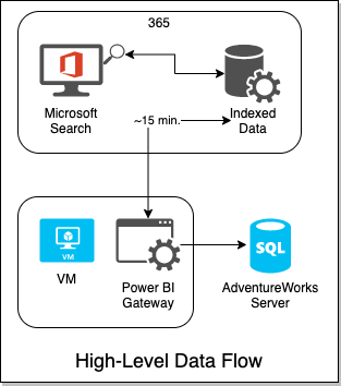
The VM's gateway will be controlled by the 365 Search service and graph connector API. Every 15 minutes, 365 will attempt an incremental crawl, by reaching out to the gateway on the VM, which will receive a query to execute agains the SQL DB on Azure. So let's get this party started.

ARMing ourselves (get it?)

Based on the above, here's what our ARM template needs to look like:

ARM Design

This diagram made possible by ARM Template Viewer.

Don't feel like making all of this? No problem! I've already set it all up and exported it to an ARM Template for you! I even went ahead and took the time to set it up a little better for automation. I've provided 2 files for you to use to get all of this provisioned automagically in your own tenant/subscription:

  • full_simple.json - this is the ARM template that represents the above design
  • runit.azcli - this is an Azure CLI script that is built for Bash.

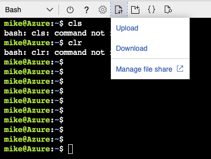
Simply put the 2 files next to each other from wherever you plan on running them. If you want to run it from the cloud shell, like I did, you'll just have to upload them first, like so.

Optional: upload the files to Cloud Shell

The ARM Template JSON has a number of preset variables you should know about. If you want it to run successfully, you'll need to set them to be something unique for you. These variables are:

  • rg - A reprint of the resource group you plan on putting everything in. That will also get set in the runit.azcli. This name just gets used in some of the more generic naming of things like the NICs and NSGs that I'm hoping you don't have to even think about.
  • vmname - The name of the VM that will get made for you
  • location - This also gets set in runit.azcli so you don't necessarily have to set it here.
  • servers_serverlessserverpoc_name - The name of the database server that will be created
  • adventureworks_dbname - The name of the database (defaults to HomolWorks)
  • uniquedomainprefix - Should probably be the same as the name you pick for the VM - using this will make RDP'ing easier
  • my_ip - if you set this, then your IP will be automatically added to the firewall rules for the Database server
  • sqladmin_account - the SQL admin user name. Defaults to POCAdmin
  • vmadmin_name - the VM admin user name. Defaults to captainawesome

Run it!

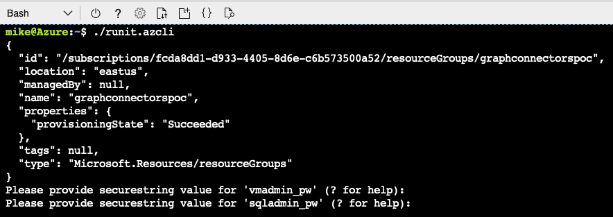
The script only has 3 variables it tries to preset before deploying the ARM template. Naturally you could edit this all you want and feed in more parameters rather than setting them up in the .json file. Only 2 variables really need to be set: rg and location. This ARM template is scoped to a resource group, so the script creates that Resource Group first, then deploys the ARM template to the group. Note that you can optionally set the IP you're developing from in the my_ip variable.

Once you've set rg and location, run the runit.azcli script from a terminal using Bash or Zsh. I ran mine from Azure Cloud Shell.

Running the Script

Not so bad so far, right? If you're feeling really adventurous, be sure to look over the ARM Template in full to see everything we've got going on. Lots of small stuff has been squirreled away so you don't have to care.

NOTE that I did actually get an error running the template, which was during the setup of one of the advisors for the SQL database, where I was told the resources were busy. But everything had actually executed fine, at least for the purposes of this Proof-of-Concept. So if you get that error, just make sure that the AdventureWorks database was provisioned in the new resource group and you should be good to go.

So, we're ARMed. What do we have to show for it?

Tis but a scratch

Review and Connect

Let's review everything we have now that the script and ARM template have finished. First let's just take a look at the finished Resource Group. Quite a few resources have been generated and most of them will cost next to nothing. And here's the best part: you can just delete the resource group whenever and be done with this.

Our new resource group

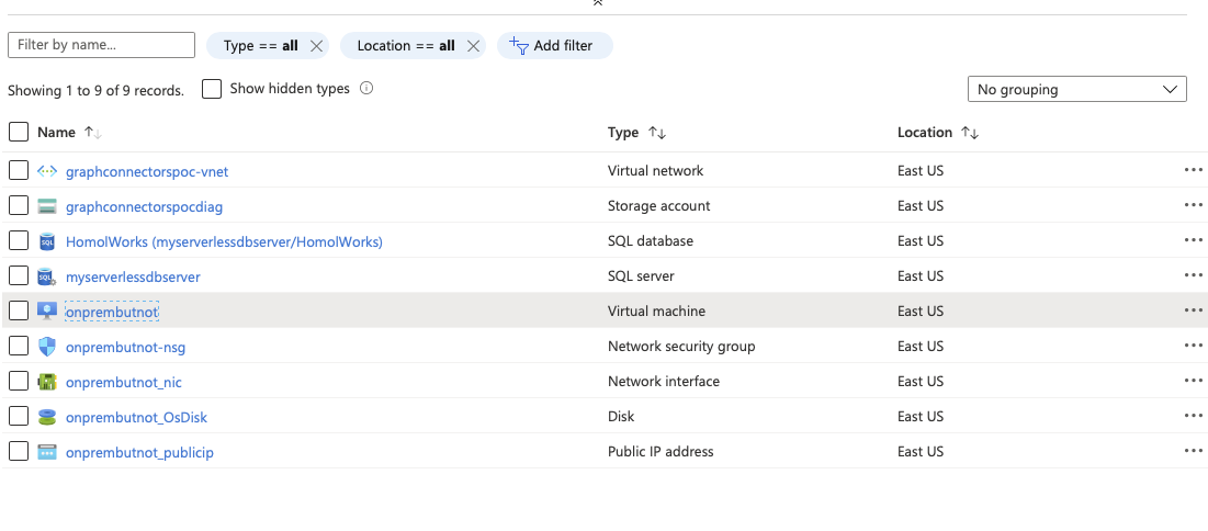
Click on the VM and notice the top right portion of the Overview tab. We have a static IP and a DNS. This will make for easy RDP, plus it has been beneficial to setting up our DB firewall.

VM IP and DNS

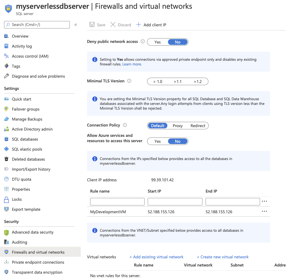
Let's see where that IP is used by SQL. Go back to the resource group and click on the SQL server. Then select the Firewalls and Virtual Networks option. Note in the IP Address rules that we already have an item added - the same IP as our VM. If you hadn't setup your IP, now could be a good time to add that a Save.

SQL server firewall

Gateway Time

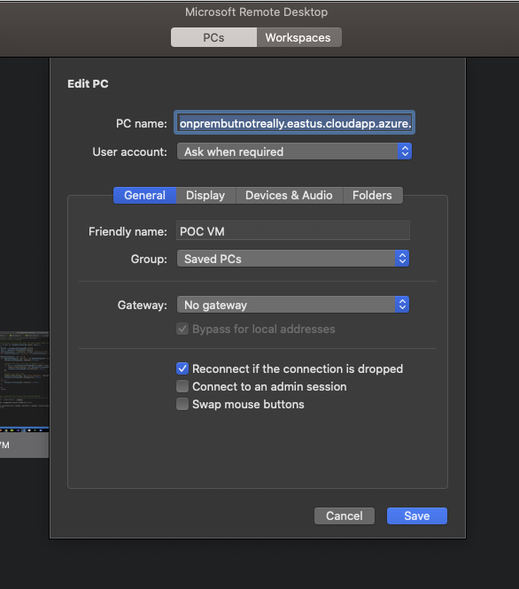
Remember that DNS? Well now's our chance to use it. Connect with your favorite RDP client, using the domain that was created and the VM admin account/password that you setup in the ARM template parameters.

RDP

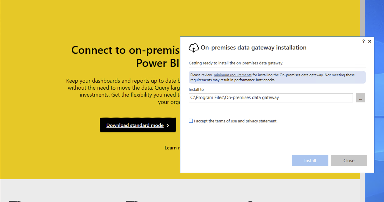
Time to install the gateway. To start go to https://powerbi.microsoft.com/en-us/gateway/ and select Download Standard Mode.

Gateway Install

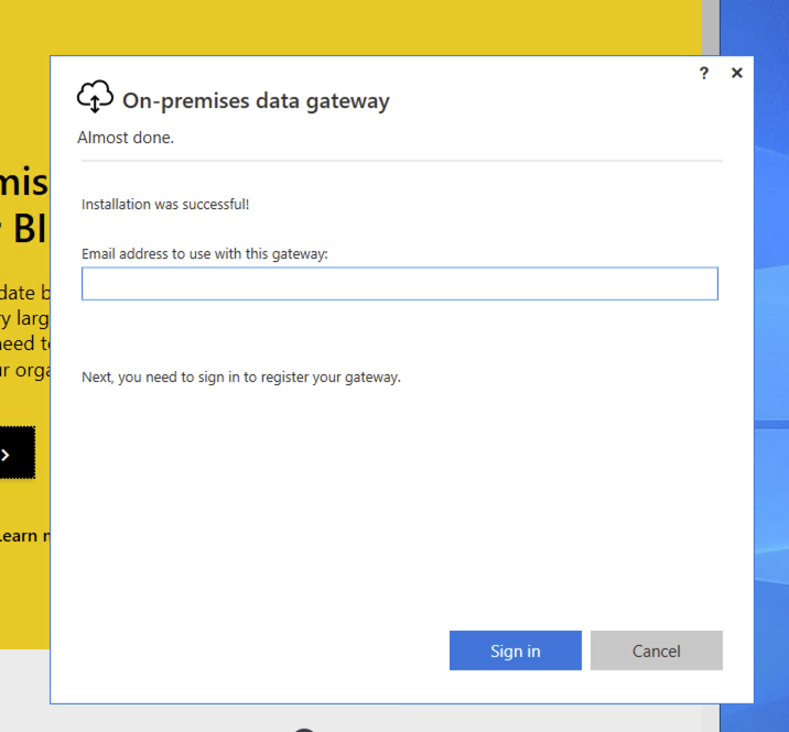
Once it's installed, sign in using your dev tenant admin account.

Gateway Signin

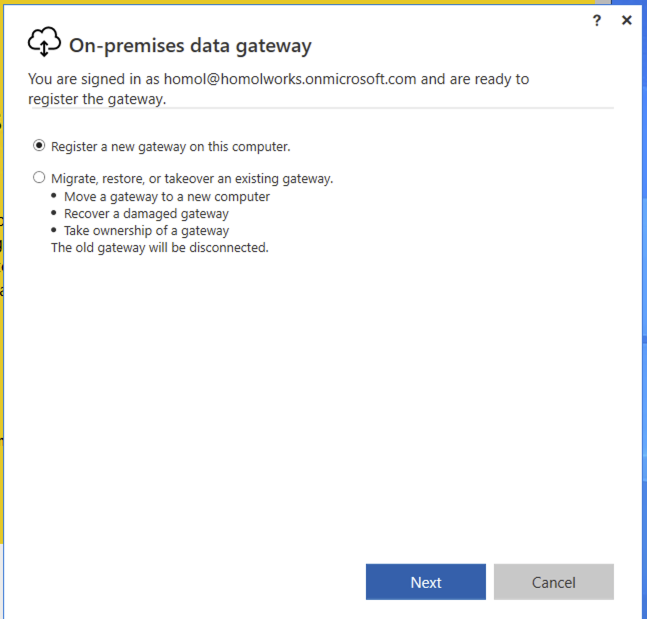
Choose Register a new gateway on this computer.

New Gateway

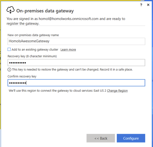
Finally, setup a name for the gateway and a recovery key (which is a passphrase of your choosing).

Gateway name and key

Graph connector setup

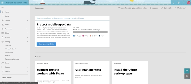
Okay, we're almost there. Time to setup our sql graph connector. First, let's confirm that you can even do this. As we mentioned earlier, this is still in preview mode at the time of this writing, so if you want to have a shot at seeing the connectors, you need to set you organization settings to getting targeted releases. See the animation below for accessing that setting from the 365 admin center:

Targeted Release Setting

Here's where you go to access connectors. In the 365 admin center, select Settings->Microsoft Search and confirm that you have the Connectors tab.

Connectors tab

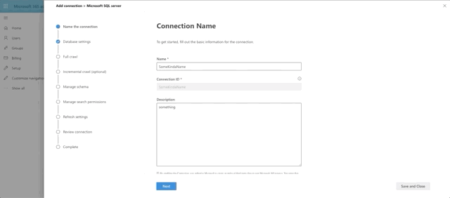
To connect to our SQL Server, click Add, then Microsoft SQL Server. Then supply a Name, a Connection ID (just a unique identifier of your choosing) and a description. Finally accept the terms to proceed.

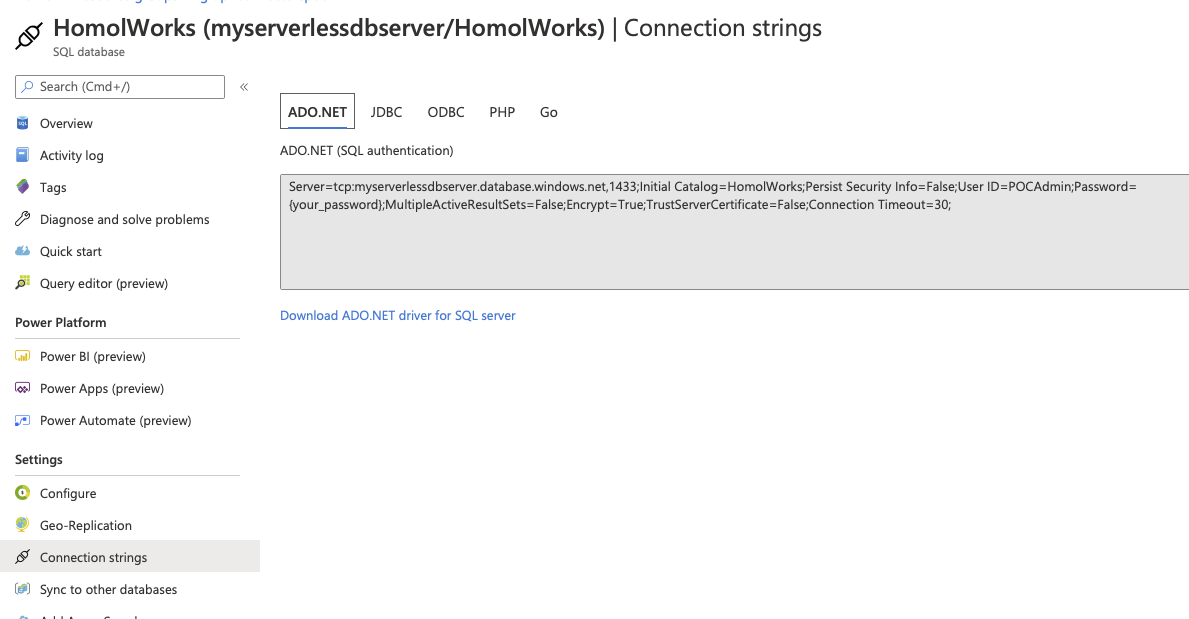
After we click Next, it's time for us to setup our database connection. Finally! To get your connection string, head back over to Azure and select your database. Then select the Connection Strings option along the left. The first tab holds the information you'll need over in your 365 dev tenant.

DB Connection String

Note that in the Database Settings step for the graph connector, the On-premises gateway is selectable. You should see the name you provided for your gateway in there. Select it. Fill out the parts need for the connection and click Test Connection.

Test the connection

What's happening under the hood is that 365 is reaching out to the gateway agent running on your VM and then making the connection to the database, which has allowed your VM to connect through it's Firewall rules. Pretty neat, huh?

Aw yeah

What exactly is in this AdventureWorks, anyway?

Okay, so the last few steps of the Graph Connector are about setting up the data to be crawled. So what exactly do we have here? We're going to focus on Products. Here's a quick snapshot of the tables though from the Azure Data Studio:

AdventureWorks Product data

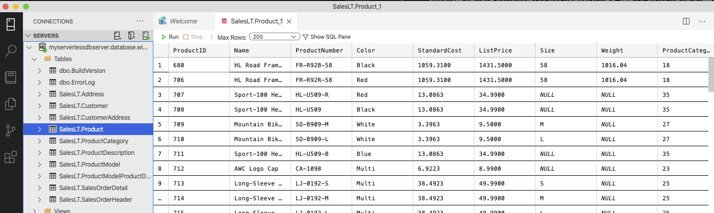
We intend to target Product and we will also include the Product Model through a join.

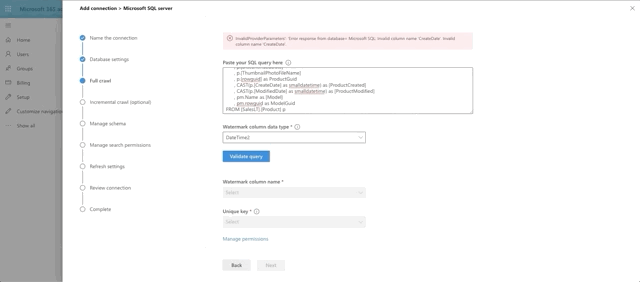
The next step in the Graph Connector setup is to provide our full crawl query. Note that we are expected to provide a date field that we will base the query off of, so that only items added after the previous crawl will be pulled to make things more efficient. This is the watermark field (@watermark). We have chosen CreateDate as that field.

Hold up. There is no CreateDate field. Well done, young padawan. Oddly enough, the MS folks didn't think to have one. So we will need to do it for them. Go back to Azure and select your AdventureWorks database. Click the Query Editor (preview) on the left hand side and log in with the database admin account you provisioned. Run this query:

ALTER TABLE SalesLT.Product
ADD CreateDate datetime not null
CONSTRAINT Product_CreateDateInit DEFAULT GETDATE()

This gets us the CreateDate field we need along with a default date in it. The first crawl is a NULL watermark anyway so everything is coming in.

With that little bonus step out of the way, here's our query for the full crawl:

SELECT p.[ProductID]
, p.[Name]
, p.[ProductNumber]
, p.[Color]
, p.[Size]
, p.[ProductCategoryID]
, p.[ProductModelID]
, p.[SellStartDate]
, p.[SellEndDate]
, p.[DiscontinuedDate]
, p.[ThumbnailPhotoFileName]
, p.[rowguid] as ProductGuid
, CAST(p.[CreateDate] as smalldatetime) as [ProductCreated]
, CAST(p.[ModifiedDate] as smalldatetime) as [ProductModified]
, pm.Name as [Model]
, pm.rowguid as ModelGuid
FROM [SalesLT].[Product] p
INNER JOIN [SalesLT].[ProductModel] pm on p.ProductModelID = pm.ProductModelID
WHERE p.[CreateDate] > @watermark

Choose DateTime as the watermark data type and press the Validate Query button. Select the watermark field, which we aliased as ProductCreated, then select the unique identifier field, which is ProductId. Notice we have a print out of the first 10 rows of data as well. Interesting side note here: currently money and float fields appear to not be supported by the graph connector. That's why ListPrice was left out of the query.

Full Crawl Step

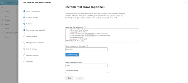
Next we set the incremental crawl. This will append anything that has been modified since the last incremental crawl run. This step is optional but I recommend it. The crawl looks very similar to the full crawl, but instead our @watermark is based on ModifiedDate instead. Here's the query:

SELECT p.[ProductID]
, p.[Name]
, p.[ProductNumber]
, p.[Color]
, p.[Size]
, p.[ProductCategoryID]
, p.[ProductModelID]
, p.[SellStartDate]
, p.[SellEndDate]
, p.[DiscontinuedDate]
, p.[ThumbnailPhotoFileName]
, p.[rowguid] as ProductGuid
, CAST(p.[CreateDate] as smalldatetime) as [ProductCreated]
, CAST(p.[ModifiedDate] as smalldatetime) as [ProductModified]
, pm.Name as [Model]
, pm.rowguid as ModelGuid
FROM [SalesLT].[Product] p
INNER JOIN [SalesLT].[ProductModel] pm on p.ProductModelID = pm.ProductModelID
WHERE p.[ModifiedDate] > @watermark

Similar to the full crawl, choose DateTime as the watermark data type and press the Validate Query button. Select the watermark field, which we aliased as ProductModified, then select the unique identifier field, which is ProductId. I skipped the soft delete section for now. I also skipped leveraging any type of row-level security, which is actually supported and documented in Microsoft writeup on the SQL Graph Connectors. Essentially, you would need to include ACL columnsin the full and incremental crawls, named AllowedUsers, AllowedGroups, DeniedUsers, and DeniedGroups. Each column is expected to be comma or semicolon delimited and can include UPNs, AAD IDs or Security IDs. I just wanted to see if we could get this data coming back and looking good!

Incremental Crawl Step

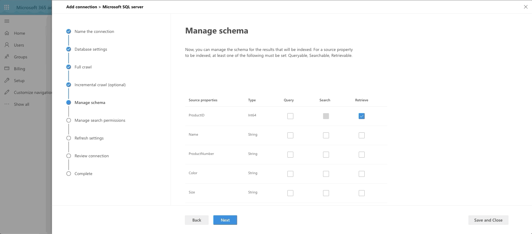
The last big step is our Manage Schema step. We define what can be queried, searched and retrieved. If an item is found in search, you can only show it in the adaptive card layout if it's been marked as Retrievable, thus added to the schema. So select what you want. I went with anything text-based to be searchable and pulled almost all fields into the schema by marking them as Retrievable.

Manage Schema Step

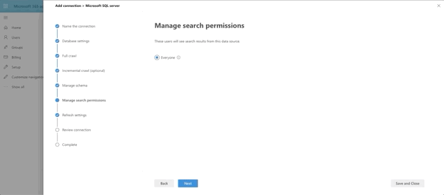
The last few steps are a bit of a breeze, especially since I chose not to do ACL columns and row level security.

Final Steps

Results design and vertical

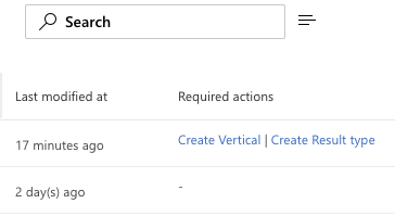
Our final step is to create our vertical and design the result set. After creating the connector, you'll see some callouts on your new connector in the Required Actions column. You can either click there to set things up or you can access Results Types and Verticals in the Customizations tab. As of the time of this writing, the best order of events is to setup the Result Type first then the Vertical. If you do it the other way, you will have 1 extra step to Enable the Vertical after you finish setting up your result type.

Required Actions

Time to Adapt

Let's start with the Result Type. Here are the basic steps, which the below GIF flies through:

  • Set a name for the result type
  • Tie it to a Content Source, which will be the new Graph Connector you made
  • Apply any display rules (I skipped this)
  • Design the layout
  • Review and Finish

The big thing here is our layout design. We are provided a link on this step to the Search Layout Designer. Select a design to start with and Click the Get Started button. This takes you to the designer where you can layer in the fields you want to replace the template with. We want to make some substantial changes, so let's click the Edit Layout button. This layout designer leverages the Adaptive Card schema to do it's magic. Also, any field we set as retrievable and is in the schema is now a field we can display in the layout. Here's what I built:

{
"type": "AdaptiveCard",
"version": "1.0",
"body": [
{
"type": "ColumnSet",
"columns": [
{
"type": "Column",
"width": "auto",
"items": [
{
"type": "Image",
"url": "https://github.com/mhomol/AdventureWorksThumbs/blob/master/thumbnails/{ThumbnailPhotoFileName}?raw=true",
"size": "Medium",
"horizontalAlignment": "Center",
"altText": "Not available"
}
],
"height": "stretch"
},
{
"type": "Column",
"width": 8,
"items": [
{
"type": "TextBlock",
"text": "[{Name}](https://somemadeupurl.net/{ProductID})",
"color": "Accent",
"size": "Medium",
"weight": "Bolder"
},
{
"type": "TextBlock",
"text": "{Model} ({ProductNumber})",
"weight": "Bolder",
"color": "Warning"
},
{
"type": "TextBlock",
"text": "First sold on {{DATE({SellStartDate}, LONG)}}",
"spacing": "Small"
}
],
"horizontalAlignment": "Center",
"spacing": "Medium"
},
{
"type": "Column",
"width": 3,
"items": [
{
"type": "FactSet",
"facts": [
{
"title": "Color",
"value": "{Color}"
},
{
"title": "Size",
"value": "{Size}"
}
]
}
]
}
]
}
],
"$schema": "http://adaptivecards.io/schemas/adaptive-card.json"
}

Feel free to paste this into the Layout Payload Editor to see what it will look like. If you want to see a preview of it you'll need sample data to paste into the Sample Data Editor tab. Try this:

{
"Name": "Classic Vest, L",
"Model": "Classic Vest",
"ProductNumber": "VE-C304-L",
"ProductModified": "2008-03-11T10:01:36Z",
"SellStartDate": "2007-07-01T00:00:00Z",
"ProductId": "866",
"Color": "Red",
"Size": "M",
"ThumbnailPhotoFileName": "awc_jersey_male_small.gif"
}

What's the deal with the thumbnail?

Here's the last "special" thing we wanted to add to the heap of "All the Things". In the AdventureWorks Products table, there are Thumbnail binaries and Thumbnail names. Well, of course, I wanted to see these thumbnails come through in the results. Varbinary fields aren't supported by the crawler, so I had 1 of 2 options: either make an endpoint that would pull the item from the database for the Product ID on any call and return the byte array as the response or pull all of the binaries out of the database once and save them to files elsewhere. I chose the latter. Here's the source for it if you want to do something similar yourself. So now I had the files I needed in github, named by the ThumbnailPhotoFileName field value. So that's how I'm able to include that in my layout.

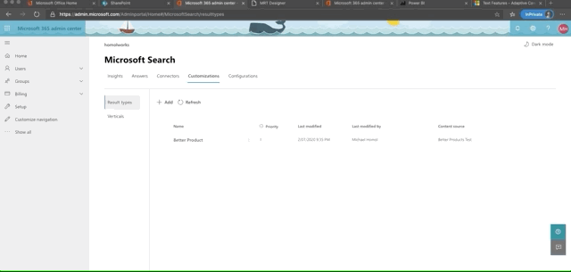
Here's a quick rundown of setting up the Result Type:

Result Type Setup

Last, but not least, we make our Vertical. It's even simpler.

  • Provide a name
  • Select the Content Source
  • Provide a KQL query (optional I skipped it)
  • Review and Finish
  • Click the button to Enable Vertical

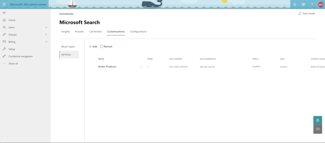
Here's a quick rundown of setting up the Vertical:

Vertical Setup

Out of the oven

Finished Product

So what exactly have we cooked up here? Let's head over to a search box somewhere and type something in that we know is a word in the Products or Models. How about mountain?

Search up mountain

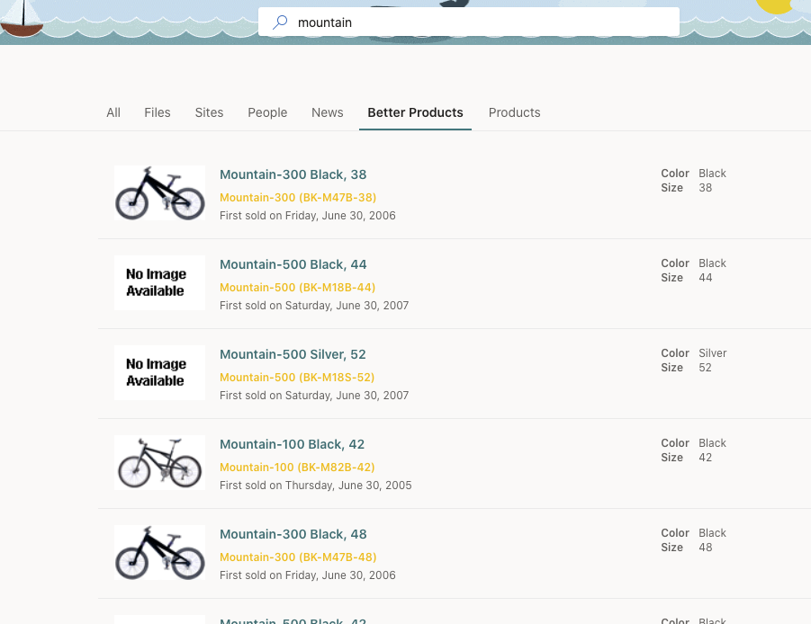
So there we have it! It was a lot to toss into the pot, but I think we brought it all together nicely. Hope you've learned a little something and that it gets you thinking about what you want to do next with the new Graph Connectors and what other structured data you may want to start piping into Microsoft Search for your customers and employees. Don't forget to delete this resource group when you're done messing around. Enjoy!

Mike-rosoft Learn Highlights for July

Mike Homol

Mike Homol

Principal Consultant @ ThreeWill

Like a good nerd, I'm a sucker for gamification and achievements in all of their forms. So I've taken to MS Learn badges and trophies like a duck to water. On the plus side, it's already single-handedly gotten me an Azure Developer Associate certification. So I'm giving back by doing a monthly series where I highlight some Learn badges that I felt were exceptional and deserve to be viewed.

This Month's Highlights

Publish an Angular, React, Svelte, or Vue JavaScript app and API with Azure Static Web Apps

Microsoft Ignite was all digital this year but was still pretty fun. It was like a giant Channel 9 event. In that event, John Papa did a great session unveiling Azure Static Web Apps. True to form, almost immediately after that unveiling, this little number showed up on MS Learn. It's great first look at a preview product, where Azure is throwing their hat into the ring with other JAMstack hosting services, like Render, GitHub pages, or GitLabs. I definitely recommend this walkthrough - it's quick, easy and free to try and you get a good glimpse of everything that's supported.

Enable automatic updates in a web application using Azure Functions and SignalR Service

SignalR is such a fun piece of technology. I had a blast building this one and watching things work. This is a methodology any developer should keep in their back pocket.

Expose multiple Azure Function apps as a consistent API by using Azure API Management

I have to imaging the Azure API Management can get pretty pricey so I haven't actually done any of this in a production sense, but the lessons surrounding Azure API Management are pretty neat and put a great bow on your API structure. But this particular lesson, which shows you how to pull disparate Azure functions into a single cohesive API, both structurally for you or your organization but also for consumers of said API, is really strong and shows you the true power of Azure API Management

Build a web app with Blazor WebAssembly and Visual Studio Code

I have high hopes for Blazor in the long run. The route of building WebAssembly is some pretty interesting stuff and this is a great introduction to the technology and nicely self-contained. Hopefully it will leave you wanting more.

Better Sharing is Better Caring

Mike Homol

Mike Homol

Principal Consultant @ ThreeWill

As the PnP Weekly adage goes, "Sharing is Caring". So I posit the following: does this imply that "Better Sharing is Better Caring?" You be the judge. 😜

Current state of knowledge sharing - it's great!

The state of sharing in the development world, particularly thanks to the gains of open source over the years, has never been stronger. We can push code to GitHub almost instantaneously. We have lots of ways of describing our code to others using markdown files, typically at the root of our solution. Maybe we've even gone the distance and built out a set of GitHub pages. In it we have real writeups on specific features with example snippets of code or showing how to use our product.

But can it be better?

Have you ever felt like there's almost too much to learn and to unpack? Developers are expected to move faster than ever and know more than ever. How do you move quickly when you're jumping into a new technology or project without feeling overwhelmed? Is there more that we can add to our tool belt to assist with knowledge sharing, documentation or investigation? Allow me to throw at you 2 new technologies to assist in this endeavor: Jupyter Labs and CodeTour.

Jupyter Labs

Jupyter Labs comes from the Python world of data science. But it has moved far beyond just that. Essentially, it leverages Python to allow for different languages to have a runnable kernel against a jupyter notebook. What this gives you is something quite powerful and cool. It's a web application that allows you to create and share documents that contain live code, equations, visualizations and narrative text.

I once described it to my team as this: imagine having a wiki with runnable code snippets directly in the wiki. One of my teammates, upon seeing a demo for the first time, described it in a somewhat opposite way: it's like code with way better commenting. Either way you look at it, it's certainly more powerful that just code or just documentation.

Getting Jupyter Labs set up

Jupyter's site has instructions to install here. But just doing that isn't going to be as powerful, especially if you're a Microsoft developer. Jupyter's base install is a Python notebook that can run in the Kernel, We want to deal in things like C# and PowerShell. So lets add that to kernel using .Net Interactive. Personally, I think Scott Hanselman's instructions here may be your best bet, especially if you're on Windows. This means you'll need Anaconda installed first (remember all this is based on Python).

PowerShell Core

As you've probably already caught on, this is Python and cross-platform. This means we Microsoft folks need to stick with all things Core. .Net interactive's notebooks give us C#, F# and PowerShell Core though, so we have some fun things we can do. This does mean that the PnP PoSH folks are on the outside looking in, until it supports PowerShell Core. But hopefully that's coming very soon. So check out what we can do using PowerShell Core, in the examples below, and hopefully that will get your mind spinning about other things you could do, including when PnP gets added to PS Core.

Azure CLI example

So keeping in mind that we are sticking to PowerShell Core, I whipped up a few examples of utilizing other CLI's with PowerShell to do some computing. Let's start with Azure CLI. Below is something simple. I just copied the MS documentation for getting started with the CLI into a notebook.

It's a totally different way to imagine documentation. Allow readers to instantly see the results, in the context of their own data!

Office 365 CLI example

Let's look at another aspect of using these notebooks: helping your team get something done. In this example, I've crafted some instructions to give to someone to create a site with the same theme that I made inside my tenant. Check it out.

Code Tour

Let's end with a bang. I have absolutely fallen in love with this next one: CodeTour. It's pretty new extension for VS Code and allows for providing a tour of your solution. As someone who has a passion for learning and teaching, I can't think of a better way to handle the onboarding experience for coders than a guided tour. And there are many other applications too. Recently, the PnP team used Code Tour to assist with the SPFx Project Upgrade. I'm sure once you play around with it, you will also think of new applications for it.

Install the CodeTour VS Code extension

Get the extension here. I'm assuming that you already have VS Code. 😜 Also, a shout out to Jonathan Carter, the brains behind this. He's very receptive to feedback too so hit him up.

CodeTour example

I'll stay on point here and keep within the realm of PowerShell. Here's something I did recently for a PnP Provisioning Script for a client.

As you can see, it's a wonderful and powerful way to onboard or to simply amp up your documentation for a piece of code or for a script like this one.

Conclusion

Hopefully I've provided you some new thought-starters for better ways to share information. These technologies and others should become part of our best practices tool bag. They allow for easier explanation of code, faster results in collaboration, simpler paths to onboarding and so much more. Please take the time to consider how you might use these solutions on your next project.

The trick to migrating list parts on a page with custom views with PnP

Mike Homol

Mike Homol

Principal Consultant @ ThreeWill

Adventures in PnP PowerShell provisioning templates

Has this ever happened to you? I had built a custom list with a custom view. To be more precise, I had basically lifted Chris Kent's sample here for a custom FAQ and dropped this on the page and the client was thrilled with it just as it is. Thanks Chris! Here's what the FAQ page looked like on the template site:

The way an FAQ should look
Not a bad looking FAQ list, right?

But this is just the beginning! This was my template. I need lots of sites to have this same FAQ page as a starting point, and it needs to look this good too.

So, onto provisioning with Powershell and PnP! At first I was running this:

Get-PnPProvisioningTemplate -Out $templateFull -Verbose -PersistBrandingFiles `
-PersistPublishingFiles -IncludeAllClientSidePages -Force
Apply-PnPProvisioningTemplate -Path $templateFull

Looks familiar right? Well pretty much everything was working great except for this:

No bueno FAQ
Not so good. Also don't focus on the color difference lol

What the heck was going on here? The view and the list were migrating just fine, but that view was not getting applied! Or, was it? I noticed this in the List part properties:

FAQ Properties
Something is amiss

See anything off? Nothing is selected in the view drop down, even though it is selected in the my template site.

Acting on a Hunch

So here was my hunch. Perhaps, the pages are getting deployed before the custom list and custom view, sooo when the page gets made, there's no view to select, which is why it looks like the above. I acted on this hunch, by doing the following:

I split out just the FAQ list portion from the full Get-PnPProvisioningTemplate - essentially doing 2 Gets: one for the list only and one for everything else. Here's what that looked like:

Get-PnPProvisioningTemplate -Out $templateFull -Verbose -PersistBrandingFiles `
-PersistPublishingFiles -IncludeAllClientSidePages -Force
Get-PnPProvisioningTemplate -Out $templateListOnly -Verbose -Handlers Lists `
-ListsToExtract "FAQ" -Force

Now you have 2 files. But there's 1 trick to this, if you want it to work in your favor. You need to open up the XML file for everything, and delete just the ListInstance node for the list (in my case, FAQ) from the XML file. So you can't easily do this all in one full script. You'd have to keep your pulls separate from your applies because of this manual intervention.

Then I applied my 2 files separately as well, starting with the lists first:

Apply-PnPProvisioningTemplate -Path $templateListOnly
Apply-PnPProvisioningTemplate -Path $templateFull

And, viola! My FAQ list was displaying as expected on the page, because the view was already found for the web part property because it already existed.