Reviving iOS Widgets on Expo SDK 55 (and Why They Went Black)

· One min read
Mike Homol
Principal Consultant @ ThreeWill

Home-screen widgets for Memento Mori came back to life on Expo SDK 55 — but not before a stretch of black squares that looked like a React layout bug and were actually an extension packaging problem.

What happened

  • Rebuilt widgets against Expo SDK 55 with expo-widgets patches and EAS multi-target signing
  • Black widgets traced to JS bundle copy into ExpoWidgetsTarget.appex, postinstall idempotency, and extension runtime symbols
  • Hardened TestFlight / IPA CI gates so widget regressions fail earlier
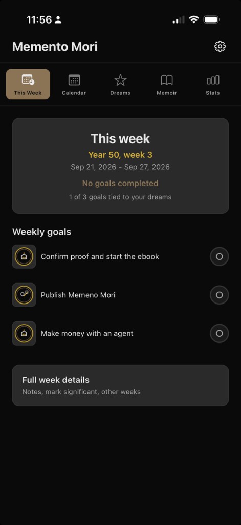
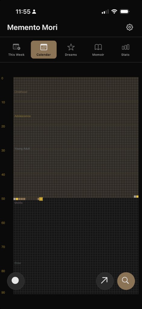
  • Current home-screen set is readable again — life % ring, weekly check-ins, and Dreams vs time — after the black-widget era
  • Smart Record is active again (not gated off for release): speak stream-of-consciousness reflections and get a bulleted summary; in final testing ahead of app go-live

Memento Mori home-screen widgets after the Expo SDK 55 fix

Smart Record — talk freely, get a bulleted reflection summary

Ruddr MCP v0.3.0 — What Shipped in the First Public Release

· One min read
Mike Homol
Principal Consultant @ ThreeWill

Ruddr MCP Server left the internal toolbox and landed as a public ThreeWill release — a self-hosted stdio MCP that puts PSA data into Cursor and Claude Desktop.

What happened

  • Prepared and tagged public release v0.3.0 — confirmed against the Homol Works Builds page listing
  • README, changelog, and security policy updates for an external audience
  • Public write-up direction: install-first — help people who want a test drive get the release zip wired into Cursor (not just a tool-surface tour)
  • Showing up in Cursor as an enabled Home MCP server (ruddr, 20 tools) once configured

Ruddr highlighted in Cursor Home MCP Servers

Weekly AI Builds - July 8, 2026

· One min read
Mike Homol
Principal Consultant @ ThreeWill

A packed week across personal apps, Homol Works comeback work, and open-source releases — including the first public cuts of Ruddr MCP and Advanced Page Properties.

Highlights

  • Revived Memento Mori home-screen widgets on Expo SDK 55; Smart Record is active again and in final testing before app go-live.
  • Brought Homol Works back online with a terminal theme, gopher logo, Builds page, and weekly AI-build drafts.
  • Cleared an App Store blocker for Backseat Games, open-sourced Advanced Page Properties (SPFx 1.23) with a demo spotlight shot, and tagged Ruddr MCP v0.3.0 with an install-first public write-up plan.
  • Advanced Managed Services shelf work: Scorecard metrics UX, MS Pulse packaging, and a DDS Referrals demo-reset pipeline.

Learn More

Transmission Resumed — A Year Inside Cursor

· 12 min read
Mike Homol
Principal Consultant @ ThreeWill

STATUS: SIGNAL REACQUIRED · HOMOL WORKS ONLINE · OPERATOR: MIKE HOMOL

Transmission resumed — AI-generated hero image, human reviewed

If you have been here before, the gap is obvious.

My last post on this site was Consult the Oracle in early 2023 — me staring at ChatGPT like it was the promised evolution of artificial intelligence, already wondering what it would do to coding, writing, and the shape of "thinking jobs." Then life got loud, client work stayed loud, and Homol Works went quiet.

The builder did not stop. The blog just did.

This is the transmission coming back online — and the honest recap of what the past year has looked like once Cursor became less of a novelty and more of how I actually work.

Consult the Oracle - the seismic shift of ChatGPT

· 4 min read
Mike Homol
Principal Consultant @ ThreeWill

The future has arrived in the form of ChatGPT.

Consult the Oracle

So I'm late to the party on ChatGPT. Doesn't matter. I have to write about it, as it's just too groundbreaking to not.

I returned from break to find my coworker talking up ChatGPT. I had heard a few things already but folks had just referred to it as a chat bot. Umm, it's so much more. Once my buddy showed me the blog post it rendered when he gave it a simple topic suggestion and then the PowerShell script it created based on the idea he fed it, I realized I was looking at something far more than a chat bot. This was the promised evolution of Artificial Intelligence.

Like any other good coder, I started tinkering around and haven't stopped thinking about what I could or should be doing with this technology.

Here are my initial predictions and thoughts on how this will impact us and the world.

Always start with it

Basically, anytime you have something to do: research, guidance, recommendations, starting a coding solution, planning, scripting, you name it. Check ChatGPT first. Use it as something to do a baseline against, if nothing else. You should see your productivity go up and I won't be surprised if companies start to expect that as well.

Scaffold your code with it

If you have a product or idea for a program or app or coded solution, use this to get it scaffolded. It's not yet at a place where it can make complex solutions based on a multitude of feature inputs, but you could definitely ge there just by communicating with ChatGPT in chunks. The code may not be functional or perfect, but I can guarantee you will have something to start with much faster than anything else you've ever used. Plus, starting out something can feel tedious and repetitive and this just expedites it even more.

"Thinking" jobs are going to shrink, eventually

Is this a future that scares me a bit? Yes. We always associated robots with replacing manual labor but this is the moment I'm understanding that even the thinking jobs, like coding, writing, imagining, engineering could also be replaced. If nothing else, you'll need fewer and fewer people with the idea and the means and the code monkeys and designers can be replaced entirely. Andrew Yang's UBI is sounding more and more appealing. In all seriousness, as a father of 4, I worry about a world in which fewer and fewer people are needed to get things done, as it could allow for an even further divide in our already divided class system. In a world where people may be needed to "do" things less and less, I may be encouraging my children to get back to the basics and be sure that they are self-sufficient and capable of doing the jobs no one wants to do. It may be all that's left at the end - or get a job with SpaceX and hop of this rock lol.

I knew that Neuralink would be something special, but now I feel like I can conceptualize it even for myself. I find myself wanting to treat ChatGPT as an extension of my own consciousness, even though it's working independently. Once I have fed it something and received information back, I can't unlearn it, so it becomes a part of me. I feel like this will be the outcome of a Neuralink that is paired with this type of underlying technology, at instantaneous speeds and interfacing directly with the brain. Kind of mind-boggling really.

That's my first impression of this groundbreaking technology. It is truly game-changing. It's our modern Oracle.

Why should my organization care about power platform adoption?

· 5 min read
Mike Homol
Principal Consultant @ ThreeWill

On your digital employee experience journey with Microsoft and the 365 ecosystem, you're going to encounter an opportunity to adopt the Power Platform and grow its use within your organization. Should you jump at this chance?

Part of the Journey

In our world of hybrid work, it is a necessity for your organization to embark on a digital employee experience journey. You want your physical workplace to have all of the necessities and process in place so your people can both "get their work done" but also thrive within your organization. Your digital workplace needs to do the same.

As your organization and your people mature, hopefully they will find new and exciting ways to contribute and innovate. If you've chosen Microsoft 365 as the basis for your digital workplace and employee experience, then you will inevitably encounter the Power Platform. When this moment comes, you will be faced with a choice: to embrace or ignore.

Who does this benefit and how?

This decision to adopt Power Platform can be seen through many different lenses, but I want to focus on these 3 key beneficiaries:

  • Me
  • My Team
  • The Organization

As we look at these beneficiaries, I will break it down into 2 ways we can measure the success of adoption:

  • The innovation or improvement it can provide
  • The ROI it might provide

How will it benefit me?

In this case, we are talking about the individual or citizen developer: your people.

Innovation/Improvement

Replace repetitive tasks with flows or apps to improve my focus on what really matters

Quantitative ROI

Time saved per day vs Time spent to make a flow or app

How will it benefit my team?

Here we are looking at the leader or decision maker of a team or group or department/division.

Innovation/Improvement

Replace regular, and potentially involved, manual business operations with a flow or app to create new efficiencies and potential to focus on brand new opportunities and ideas

Quantitative ROI

Time saved in a year vs Time spent to make solution

How does this benefit the organization?

Here we want to look at the benefits as perceived from the "C suite" perspective, assuming the previous 2 barriers have been surpassed.

Innovation/Improvement

Replacing all of these various manual and/or outdated tasks creates space for new innovations and new ideas

Quantitative ROI

Either cutting costs or improving efficiencies and creating new opportunities for growth

Are these benefits real?

So there can be benefits seen all the way up through the organization. But are these benefits real? I certainly think so and here at ThreeWill we have seen this evidence at all stages. But what does Microsoft have to say about it? They have studied it enough to be able to put their learnings into a Power Platform ROI Calculator. According to them, the return-on-investment calculator is an interactive model based on The Total Economic Impact™ of Microsoft Power Platform, a commissioned study conducted by Forrester Consulting. As you dig in, you'll see that this is something that has been analyzed deeply and these benefits aren't just "pie in the sky". These have real dollars associated to them and we know that innovation can sometime be priceless.

You should take the time to review the entirety of the study and what was found, but I want to point out just the quantified benefits:

  • Citizen developer projects completed using low-code/no-code tools cost less.
  • The organizations replaced third-party business applications and business intelligence tools with Power Platform.
  • Solutions built with Power Platform made users of all types more efficient.
  • Power Platform delivered improved business outcomes across many dimensions.

Where to start?

When getting started with Power Platform, you may be inclined to just "turn it off" for now. Here's what I would say on the matter: your instinct is not wrong, but perhaps it doesn't need to be that drastic. Here's the reality: Microsoft has made the citizen developer their #1 priority and if that creates more hassle for IT, so be it. Thankfully, there are some things that can be done early and quickly so that you don't have to throw out the baby with the bathwater.

Now there is more than just one thing you can do to get started and I have plenty to say on the matter. Additionally, I'd be remiss if I didn't recommend talking to ThreeWill first to make sure you get started in the right way. But here's my first clue for you, if you truly are just getting started with the Power Platform and feel like adoption is something you want: Visibility.

Governance without Analytics is just your opinion

Remember that you can't govern what you can't see. And if you can't govern or monitor it, how will you help people grow with it? So your first order of business will be to set yourself up for success with better visibility and a process that can respond and work with this new level of insight. This will allow you to feel empowered to open the flood gates. This is a service offering at ThreeWill: a Power Platform governance workshop, where we will work with you to help setup a Microsoft Center of Excellence and the implied necessary process, along with a step-by-step road map of next steps for success.

The following was a cross-post from ThreeWill

Improving Page Properties in SharePoint

· 12 min read
Mike Homol
Principal Consultant @ ThreeWill

Recently, I had the privilege of making my first post on the PnP Tech Community Blog. This is just a cross-post of that same article. Enjoy!

P.S. It's been a year since I started up this new blog and, while my regular posting has been down, this is definitely better than I've ever been about communicating what I know and do. The fact that a year in I'm now a contributor to now 2 different PnP repositories and an author in the tech community blog feels good. Now, on to the post.

Improving the Page Properties web part

Ever get annoyed with the page properties web part put out by Microsoft? If you've got some OCD issues (like me) then it may not take very long. At ThreeWill, we help clients with their digital workplaces and improving the way their users can obtain information and makes sense of it all. Oftentimes, the Page Properties web part can be useful here, as we very often add valuable metadata to pages in a digital workplace, which we often tie to page templates as well. News might roll up based on these page properties, which can assist in finding information in many ways. But its often handy to display this metadata in a clean way on a page as well. The standard Page Properties web part seeks to do just that. And, for the most part, it does a fine job with it. But it has a few deficiencies. The most annoying thing to me, when setting up digital workplaces was that it only supports a white background. But there are other small things, like the limitations with pretty standard field types. I like the idea of taking advantage of metadata columns for pages, but being able to use it visually is equally important. I finally decided to do something about it and build a new version of this web part. So with this in mind, let's lay out our goals with this new web part. We will call it the Advanced Page Properties web part.

Feature Goals

Attempt to replicate the functionality of Page Properties with the following improvements:

  • Support for theme variants
  • Updated to standard capsule look for list options
  • Support for image fields
  • Support for hyperlink fields
  • Support for currency
  • Improved support for dates

In other words, we're shooting for this: Desired End State

Property Pane

For a part like this, it's all about getting the property page figured out first. We want this to feel familiar too and not stray too much from the original design, unless it helps.

Let's start by recognizing our chief property that the web part needs: selectedProperties. This array will hold the internal names of the fields that a user has selected for display in our web part. We intend on passing this property down to our React component. Here's a look at our property object:

export interface IAdvancedPagePropertiesWebPartProps {
title: string;
selectedProperties: string[];
}

In our AdvancedPagePropertiesWebPart, we want to hold all possible properties for drop downs in a single array.

private availableProperties: IPropertyPaneDropdownOption[] = [];

Next, we need the following method to obtain the right types of properties for display:

private async getPageProperties(): Promise<void> {
Log.Write("Getting Site Page fields...");
const list = sp.web.lists.getByTitle("Site Pages");
const fi = await list.fields();

this.availableProperties = [];
Log.Write(`${fi.length.toString()} fields retrieved!`);
fi.forEach((f) => {
if (!f.FromBaseType && !f.Hidden && !f.Sealed && f.SchemaXml.indexOf("ShowInListSettings=\"FALSE\"") === -1
&& f.TypeAsString !== "Boolean" && f.TypeAsString !== "Note" && f.TypeAsString !== "User") {
this.availableProperties.push({ key: f.InternalName, text: f.Title });
Log.Write(f.TypeAsString);
}
});
}

We are using the PnP JS library for gathering the fields in the Site Pages library. Figuring out the right types of filters to gather was a bit of trial-and-error. We are excluding anything that's inherited from a base type or is hidden in any way. We are also excluding 3 standard types so far: boolean, note and user. Note doesn't make sense to display. Boolean can definitely work, but needs a good display convention. User was the only tricky object, which is the reason it isn't done yet.

We call the above method prior to loading up the property pane.

protected async onPropertyPaneConfigurationStart(): Promise<void> {
Log.Write(`onPropertyPaneConfigurationStart`);
await this.getPageProperties();
this.context.propertyPane.refresh();
}

We need handlers for adding and deleting a property and selecting a property from a dropdown. These methods make necessary changes to the selectedProperties array.

protected onAddButtonClick (value: any) {
this.properties.selectedProperties.push(this.availableProperties[0].key.toString());
}

protected onDeleteButtonClick (value: any) {
Log.Write(value.toString());
var removed = this.properties.selectedProperties.splice(value, 1);
Log.Write(`${removed[0]} removed.`);
}

protected onPropertyPaneFieldChanged(propertyPath: string, oldValue: any, newValue: any): void {
if (propertyPath.indexOf("selectedProperty") >= 0) {
Log.Write('Selected Property identified');
let index: number = _.toInteger(propertyPath.replace("selectedProperty", ""));
this.properties.selectedProperties[index] = newValue;
}
}

Finally, with all of our pieces in place, we can render our property pane with all it's needed functionality.

protected getPropertyPaneConfiguration(): IPropertyPaneConfiguration {
Log.Write(`getPropertyPaneConfiguration`);

// Initialize with the Title entry
var propDrops: IPropertyPaneField<any>[] = [];
propDrops.push(PropertyPaneTextField('title', {
label: strings.TitleFieldLabel
}));
propDrops.push(PropertyPaneHorizontalRule());
// Determine how many page property dropdowns we currently have
this.properties.selectedProperties.forEach((prop, index) => {
propDrops.push(PropertyPaneDropdown(`selectedProperty${index.toString()}`,
{
label: strings.SelectedPropertiesFieldLabel,
options: this.availableProperties,
selectedKey: prop,
}));
// Every drop down gets its own delete button
propDrops.push(PropertyPaneButton(`deleteButton${index.toString()}`,
{
text: strings.PropPaneDeleteButtonText,
buttonType: PropertyPaneButtonType.Command,
icon: "RecycleBin",
onClick: this.onDeleteButtonClick.bind(this, index)
}));
propDrops.push(PropertyPaneHorizontalRule());
});
// Always have the Add button
propDrops.push(PropertyPaneButton('addButton',
{
text: strings.PropPaneAddButtonText,
buttonType: PropertyPaneButtonType.Command,
icon: "CirclePlus",
onClick: this.onAddButtonClick.bind(this)
}));

return {
pages: [
{
header: {
description: strings.PropertyPaneDescription
},
groups: [
{
groupName: strings.SelectionGroupName,
groupFields: propDrops
}
]
}
]
};
}

Our Component and Displaying our fields/values

Our React component needs to properly react to the list of selected properties changing. It also needs to react to our theme changing. I leveraged this awesome post from Hugo Bernier for the theming, so I will not cover that in-depth, although you will see how it's being leveraged in the code snippets below. Here are the properties we plan to start with and respond to:

import { IReadonlyTheme } from '@microsoft/sp-component-base';
import { WebPartContext } from "@microsoft/sp-webpart-base";

export interface IAdvancedPagePropertiesProps {
context: WebPartContext;
title: string;
selectedProperties: string[];
themeVariant: IReadonlyTheme | undefined;
}

We will track the state of our selected properties and their values with hooks. We want to trigger off of changes to our properties, so we will setup a reference to their current state. We will also establish our themeVariant and context at the start of our component.

// Main state object for the life of this component - pagePropValues
const [pagePropValues, setPagePropValues] = useState<PageProperty[]>([]);
const propsRef = useRef(props);

const { semanticColors }: IReadonlyTheme = props.themeVariant;

propsRef.current = props;

sp.setup({ spfxContext: props.context });

So we are tracking the state of pagePropValues, which is an array of type PageProperty. What is PageProperty?

import { IFieldInfo } from "@pnp/sp/fields";

export interface PageProperty {
info: IFieldInfo;
values: any[];
}

Our effect is looking to see when changes are made to the properties, then is peforming our core logic to refresh properties and values.

/**
* @description Effects to fire whenever the properties change
*/
useEffect(() => {
refreshProperties();

return () => {
// No cleanup at this moment
};
}, [propsRef.current]);

The core method is refreshProperties. It has 2 main calls it needs to make, whenever selected properties has changed: Establish any known metadata for each property that will assist in display and obtain all actual values for this property and the specific page id that we are viewing.

/**
* refreshProperties
* @description Gets the actual values for any selected properties, along with critical field metadata and ultimately re-sets the pagePropValues state
*/
async function refreshProperties () {
var newSetOfValues: PageProperty[] = [];

if (props.selectedProperties !== undefined && props.selectedProperties !== null) {
Log.Write(`${props.selectedProperties.length.toString()} properties used.`);

// Get the value(s) for the field from the list item itself
var allValues: any = {};
if (props.context.pageContext.listItem !== undefined && props.context.pageContext.listItem !== null) {
allValues = await sp.web.lists.getByTitle("Site Pages").items.getById(props.context.pageContext.listItem.id).select(...props.selectedProperties).get();
console.log(allValues);
}

for (let i = 0; i < props.selectedProperties.length; i++) {
const prop = props.selectedProperties[i];

Log.Write(`Selected Property: ${prop}`);

// Get field information, in case anything is needed in conjunction with value types
const field = await sp.web.lists.getByTitle("Site Pages").fields.getByInternalNameOrTitle(prop)();

// Establish the values array
var values: any[] = [];
if (allValues.hasOwnProperty(prop)) {
switch (field.TypeAsString) {
case "TaxonomyFieldTypeMulti":
case "MultiChoice":
values = _.clone(allValues[prop]);
break;
case "Thumbnail":
values.push(JSON.parse(allValues[prop]));
break;

default:
// Default behavior is to treat it like a string
values.push(allValues[prop]);
break;
}
}

// Push the final setup of a PageProperty object
newSetOfValues.push({ info: field, values: [...values] });
}

setPagePropValues({...newSetOfValues});
}
}

As we loop through all of the properties that have been selected, we make calls with PnP JS to get all of the metadata per field and all of the values per field. The call to get all of the values can return with any number of data types, so we need to be prepared for that. This is why it is of type any[] to start. But this is also why we have a switch statement for certain outlier situations, where the line to set the array of any need to be done a little differently than the default. Our 3 known cases of needing to do something different are TaxonomyFieldTypeMulti, MultiChoice and Thumbnail.

React and Display

Our function component returns the following:

return (
<div className={`${styles.advancedPageProperties} ${styles.container}`} style={{backgroundColor: semanticColors.bodyBackground, color: semanticColors.bodyText}}>
{RenderTitle()}
{RenderPageProperties()}
</div>
);

RenderTitle is pretty straightforward.

/**
* RenderTitle
* @description Focuses on the 1 row layer, being the Title that has been chosen for the page
* @returns
*/
const RenderTitle = () => {
if (props.title !== '') {
return <div className={styles.title}>{props.title}</div>;
} else {
return null;
}
};

RenderPageProperties is the first of a 2-dimensional loop, where we want to display a section for each page property that was select, just like the original.

/**
* RenderPageProperties
* @description Focuses on the 2nd row layer, which is the property names that have been chosen to be displayed (uses Title as the display name)
* @returns
*/
const RenderPageProperties = () => {
if (pagePropValues !== undefined && pagePropValues !== null) {
var retVal = _.map(pagePropValues, (prop) => {
return (
<>
<div className={styles.propNameRow}>{prop.info.Title}<span style={{display: 'none'}}> - {prop.info.TypeAsString}</span></div>
<div className={styles.propValsRow}>
{RenderPagePropValue(prop)}
</div>
</>
);
});
return retVal;
} else {
return <i>Nothing to display</i>;
}
};

This method then calls our final display method, RenderPagePropValue, which performs our 2nd layer of array display, mapping all of the values and providing the correct display, based on the field type of the selected property. This is the heart of the display, where various type conversions and logic are done real-time as we display the values, including trying to achieve a slightly more modern SharePoint look using capsules for array labels.

/**
* RenderPagePropValue
* @description Focuses on the 3rd and final row layer, which is the actual values tied to any property displayed for the page
* @param prop
* @returns
*/
const RenderPagePropValue = (prop: PageProperty) => {
console.log(prop);
var retVal = _.map(prop.values, (val) => {
if (val !== null) {
switch (prop.info.TypeAsString) {
case "URL":
return (
<span className={styles.urlValue}><a href={val.Url} target="_blank" style={{color: semanticColors.link}}>{val.Description}</a></span>
);
case "Thumbnail":
return (
<span><img className={styles.imgValue} src={val.serverRelativeUrl} /></span>
);
case "Number":
return (
<span className={styles.plainValue}>{(prop.info["ShowAsPercentage"] === true ? Number(val).toLocaleString(undefined,{style: 'percent', minimumFractionDigits:0}) : (prop.info["CommaSeparator"] === true ? val.toLocaleString('en') : val.toString()))}</span>
);
case "Currency":
return (
<span className={styles.plainValue}>{(prop.info["CommaSeparator"] === true ? new Intl.NumberFormat('en-US', { style: 'currency', currency: 'USD' }).format(val) : Intl.NumberFormat('en-US', { style: 'currency', currency: 'USD', useGrouping: false }).format(val))}</span>
);
case "DateTime":
//,"",,
switch (prop.info["DateFormat"]) {
case "StandardUS":
return (
<span className={styles.plainValue}>{new Date(val).toLocaleDateString()}</span>
);
case "ISO8601":
const d = new Date(val);
return (
<span className={styles.plainValue}>{`${d.getFullYear().toString()}-${d.getMonth()}-${d.getDate()}`}</span>
);
case "DayOfWeek":
return (
<span className={styles.plainValue}>{new Date(val).toLocaleDateString("en-US", { weekday: 'long', month: 'long', day: 'numeric', year: 'numeric' })}</span>
);
case "MonthSpelled":
return (
<span className={styles.plainValue}>{new Date(val).toLocaleDateString("en-US", { month: 'long', day: 'numeric', year: 'numeric' })}</span>
);
default:
return (
<span className={styles.plainValue}>{new Date(val).toLocaleDateString()}</span>
);
}
case "TaxonomyFieldTypeMulti":
case "TaxonomyFieldType":
return (
<span className={styles.standardCapsule} style={{backgroundColor: semanticColors.accentButtonBackground, color: semanticColors.accentButtonText}}>{val.Label}</span>
);
default:
return (
<span className={styles.standardCapsule} style={{backgroundColor: semanticColors.accentButtonBackground, color: semanticColors.accentButtonText}}>{val}</span>
);
}
} else {
return (<span className={styles.plainValue}>N/A</span>);
}
});
return retVal;
};

So that's all of the necessary code. Here's what the finished product looks like, compared to the original page properties web part.

Old vs New

This web part is now officially apart of the PnP Web Parts repository and can be found here. I would love to hear about improvements you'd like to see and obviously you are more than welcome to contribute. I already have a bit of a list of things I'd love to see it do.

Other ideas for improvements

  • Capsules to be linkable to either a search result page or a filtered view of site pages (we always get client requests for this)
  • Support for People fields (this is the only thing lacking from the original)
  • Support for Boolean fields (just need the right idea for proper display, really)
  • Styling per property (ie. colorizing per property or something to that effect)

Conclusion

Hopefully, I've gotten you excited about Page Properties again and you've learned a little along the way around how the current Page Properties part might be doing what it does under the hood. Please consider contributing and feel free to reach out to me anytime. Thanks for your time!

SharePoint Theming Cheat Sheet

· One min read
Mike Homol
Principal Consultant @ ThreeWill

Starting up this little cheat sheet and will be posting the link to it on the top page. As I start to catalog various findings in the minutia of Fluent styles, as applied to SharePoint sites and parts, I'm starting to jot them down in this Markdown.

Cheat Sheet

How to make a modal window on a PowerApp screen

· 3 min read
Mike Homol
Principal Consultant @ ThreeWill

Modal windows and pop-ups are a staple of applications. Ever just needed to quickly make one in your PowerApp?

Here is a quick and easy step-by-step for making a pop-up modal window on a screen in your PowerApp.

Let's assume we have an app screen that's collecting some survey data. Like so: Start Screen

It would be nice if we could provide a little more information to explain the Account Number that is needed.

Insert a new Icon onto the screen and give it the Information image. Information Icon

Select your screen and add the following to the OnVisible event:

UpdateContext({ ShowModal: false });
UpdateContext({ ModalText: "" });

Next, select your new information icon and add the following to the OnSelect event:

UpdateContext({
ModalText:
"Your account number is located at the top right of your most recent bill.",
});
UpdateContext({ ShowModal: true });

Insert a label onto the screen and adjust it's width and height to cover the entire screen. Name this label ModalBackground and remove it's Text.
Modal Background Label

Next, set the Fill property of this background label to RGBA(169,169,169,.5). It should look like this: Gray Modal Background

Add a second label and name it ModalBox. Center it's horizontal alignment and make the vertical alignment in the middle. Additionally, give it a Fill of White, center align its text and give it some extra padding. It should look something like this when you're done. Modal Textbox

Set the Text property of the 'ModalBox' label to ModalText.

Add a Cancel Icon to the screen and place it in the top right corner of the ModalBox label. Name it ModalClose. Now you should have something like this: Modal Textbox with Close

Put the following code in the OnSelect event of ModalClose:

UpdateContext({ ShowModal: false });
UpdateContext({ ModalText: "" });

Group the 3 new controls you have added and name the group Modal. Modal Group

Set the Visible property of the Modal group to ShowModal.

If you've done everything, you're modal should look and work like so: Modal in Action

This is a quick and painless process to have modals at your disposal in your next PowerApp. Happy low-coding!

ALWAYS use Disconnect-PnPOnline

· One min read
Mike Homol
Principal Consultant @ ThreeWill

I learned a valuable lesson in the use of Disconnect-PnPOnline : ALWAYS use it!

I had a provisioning script that first connected to the tenant admin to create a new site, then switched contexts to provision files, including a newly laid out home page, onto the newly created site.

I had a connection issue midway through one particular run, where it successfully connected to the tenant admin but didn't successfully connect to the new site, but the script kept running successfully because, hey, it still had a context - to the tenant admin site.

Essentially, I was able to change the Home page of the Sharepoint Admin Center. Thankfully, I was also able to use Set-PnPHomePage to set it back to _layouts/15/online/AdminHome.aspx#/home. But my heart was skipping a few beats there for a bit.

If I had just used Disconnect-PnPOnline in between switching contexts then everything would have just stopped. So you've now been warned.