Thoughts on Customer-Centric Nav

Discovery
Recently, I was tasked with discovering the needs of a customer in order to assess their current state in SharePoint Online and needs for the future. This was for a collection of technology groups that performed a wide array of services for other employees within the company. Early on, we knew that much of what we were evaluating was a lack of access to these services via SharePoint, so much would be created for the first time. Additionally, for the content that did exist, there was a lack of understanding in where the items could be found. Another interesting issue was the lack of understanding of the functions of these groups. Basically, a number of interesting problems, but largely centering around the employees being serviced, or their customers, if you will.
To the Hub!
Based on the feedback, particularly around wanting consistency and knowing that there would be a hurdle with getting folks to know where to go, we decided early on to use a Hub for the job. It solves so many issues out of the box: consistent look-and-feel, consistent navigation, the ability to roll up content from spoke sites and search scoped at the hub level, among other benefits. But just because we now have a spot for folks to come and a place where maybe things look better and more consistent, it doesn't mean that they will suddenly know what to do. Part of the art of helping folks with SharePoint intranets or portals has very little to do with the tooling that is or isn't available in the 365 platform. Much of it is a User Experience and an Information Architecture problem. This may be my heavy marketing background at play, but it felt critical to me to deal with the hub needing to be customer-centric from the get-go, particularly the navigation.
Ways to Solve Navigation
There were many thoughts on the navigation, both from stakeholders and discovery. The default thinking around the Hub navigation was to break it up by the various domains or spheres of teams that were solving problems or serving customers. One of my first thoughts on navigation was to look into taking it towards a task-based navigation, as it seemed like customers may only know what thing they may need to do. In my UX research, I encounter the following 2 articles that I wanted to highlight:
Object-focused vs Task-focused Design
Audience-Based Navigation: 5 Reasons to Avoid It
These are great resources for gaining insights into user habits and trends. So what is actually the best way to have a navigation that keeps the customer at the forefront?
Topic-based = Customer-centric
The bottom-line is that typically task-based navigation can be very confusing to most users. So that was a wash. What becomes clear from UX research is that there isn't always a silver bullet. But UX is an iterative process. So let's find a solid starting point. Based on those articles and knowing that we still needed information to be somewhat grouped by communications site spokes - we still need to be thinking about the authoring challenges too - it seemed like our best starting point would be to go with topic-based navigation. This would allow the sub-options to still be domain or sphere-based, but should provide a customer with the terminology that they can relate to. The customer needs to see words that represent the things that have brought them out to the hub.
Example
Let's look at a quick example of one of these domains: a group that we will call PMG. They were responsible for presenting resources pertinent to PMs and the PMI certifications including in-house governance resources. Originally, we had a top-level navigation called "PMG" with sub-options. But instead we landed here:
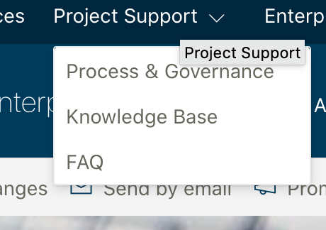
As you can see, the topic of "Project Support" aims to be a topic that should gravitate these PM users' eyes to the item that matters most to them. Is it fool-proof? No. But it's a solid start.
Final thoughts
IA and UX is 2 parts science and 1 part art, in my humble opinion. I have worked on countless websites (namely at Brown Bag Marketing) over the past 10 years with Creative and UX resources. I've seen the sheer amount of different opinions mixed with a bevy of different facts, which also tend to change. But some things have remained true: the customer needs to be at the forefront and the calls to action need to be clear and take precedence. These are just some random thoughts in that arena. Hope you found it useful.