Operational Dashboard for the Human Services Scorecard
· 2 min read

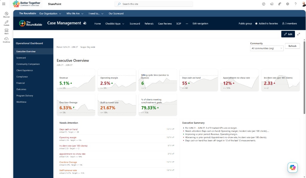
Scorecard tiles are great for a check-in moment. Operators still need a full-page place to see what needs attention across communities, compare locations, and read trends without hopping web parts. This week I shipped that shell for the Human Services Scorecard — and tightened the metric math that feeds it.
What happened
- Added a new Operational Dashboard SPFx web part with a full-page shell: Attention panel, Summary panel, community comparison, KPI strip, trend chart destinations, and shell nav/context
- Added weighted rollups and per-location goal overrides for Sum metrics so “All communities” views stop lying about local targets
- Surfaced location Needs Attention on category pages when viewing All communities
- Colored week-over-week trend arrows by target favorability (lower-is-better down = good) instead of raw up/down
- This is the next chapter for both the Human Services Scorecard and ThreeWill as a business: HSS is the spine for displaying metrics that matter to human services organizations — especially Senior Living — while we work toward automated integration with the back-end systems that bring those dashboards to life (Financial, CRM, HR, and EHR apps/services)