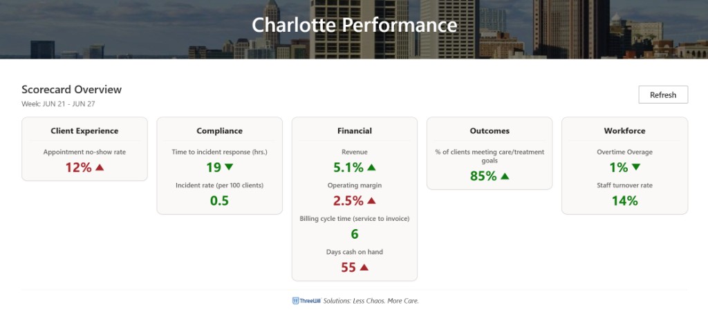
Metric Trend Overlays for SharePoint Scorecards
· One min read

Measurable trends on the Human Services Scorecard work better as a dedicated overlay and picker flow than as charts crammed into every KPI tile. This is the strong opening chapter — more is coming, including a public release.
What happened
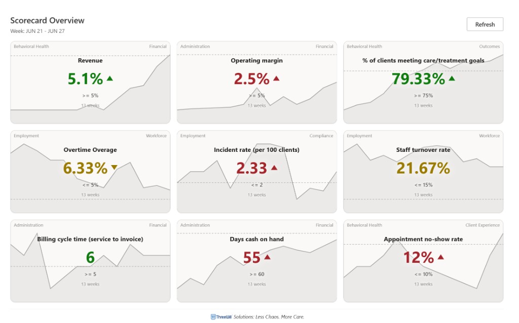
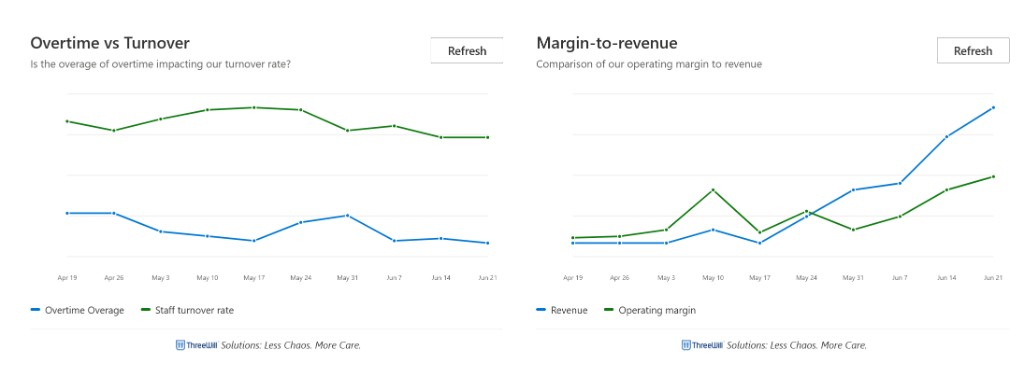
- Added a metric trend overlay, trend service, and metric picker UX on the timeline
- Gave trends their own surface instead of overloading tile layout
- Continues the Scorecard UX thread from earlier metric ordering / group-by / owner work
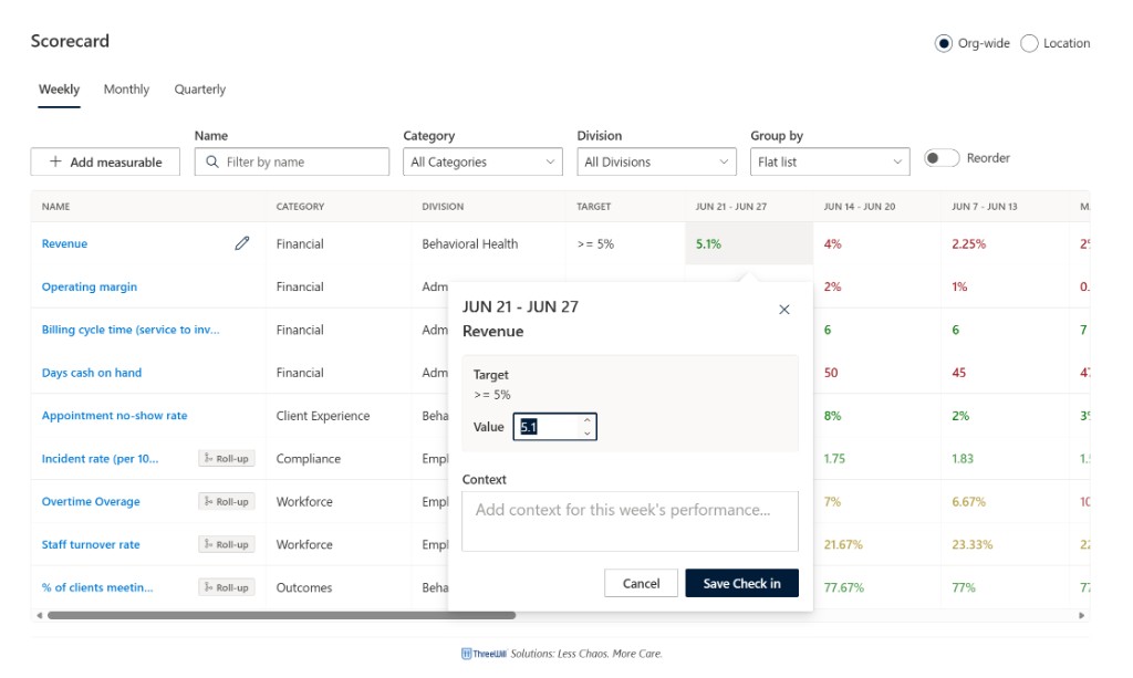
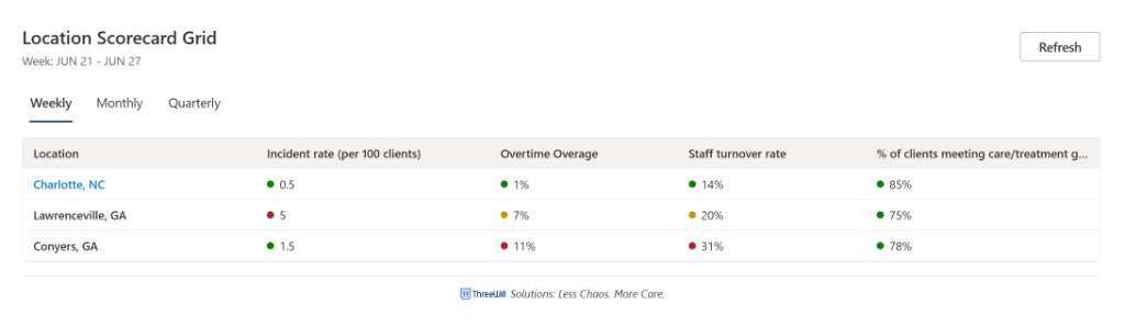
- Confirmed merged/deployed on the intended demo surface — Overview tiles with sparkline trends, weekly check-in grid, location grid, comparison charts, and location performance views
- Framing for the public story: start strong here, then ship follow-ups as the product and packaging mature toward a public release